














How Multi-Perspective SPC Dashboards Help Manufacturers Turn Quality Data into Actionable Insights
Every manufacturing plant collects quality data.
Operators measure parts.
Inspection systems generate thousands of records.
MES and ERP systems continue accumulating production information.
Yet when a quality issue occurs, many manufacturers still struggle to answer basic questions:
- Is the process becoming unstable?
- Is process capability improving or declining?
- Which production shift is performing best?
- Where should engineers begin their investigation?
The problem isn't a lack of data.
The problem is a lack of visibility.
Many factories still rely on a single SPC control chart or static reports to monitor production quality. While these tools are valuable, they rarely provide the complete picture needed for modern manufacturing.
A single chart can identify one aspect of process performance.
Making confident quality decisions requires seeing the process from multiple perspectives.
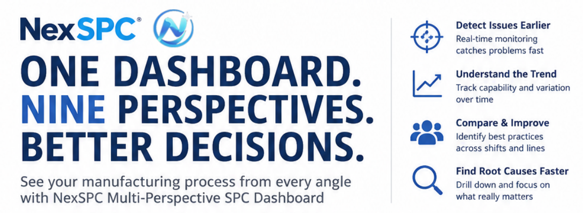
That's exactly what a multi-perspective SPC dashboard is designed to achieve.
Why One SPC Chart Is No Longer Enough
Traditional SPC focuses primarily on process stability.
An Individual (I) Chart or Xbar-R Chart can quickly identify abnormal variation and trigger alarms when statistical rules are violated.
But quality engineers rarely stop after asking:
"Is the process out of control?"
The next questions are usually more important:
- Has process capability started to decline?
- Is variation increasing from batch to batch?
- Are different production shifts performing consistently?
- Is today's performance better than last week's?
- Which process should be investigated first?
Answering these questions requires more than a single control chart.
It requires multiple analytical perspectives working together.
Think of it this way:
Every SPC chart tells one part of the story.
A dashboard reveals the complete picture.
Five Perspectives That Matter Most in SPC Analysis
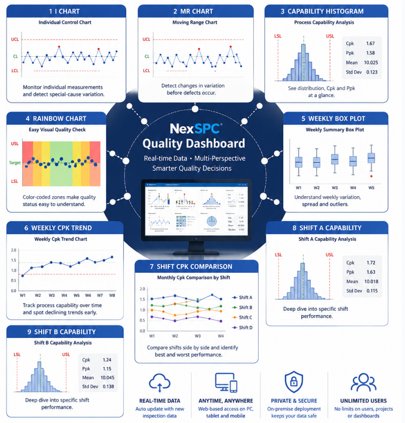
Rather than looking at nine independent charts, manufacturers should think about five complementary perspectives that work together to support faster quality decisions.
1. Process Stability
The first priority is determining whether the process remains statistically stable.
This is where classic SPC charts continue to play a critical role.
Typical charts include:
- Individual (I) Control Chart
- Moving Range (MR) Control Chart
Together they help engineers detect:
- Special-cause variation
- Sudden process shifts
- Increasing instability
- Abnormal trends
Real-time monitoring allows operators to respond before small variations become production defects.
2. Process Capability
A stable process does not automatically mean a capable process.
Manufacturers also need to understand whether production consistently meets customer specifications.
Capability analysis typically includes:
- Process Capability Histogram
- Cpk Analysis
- Ppk Analysis
- Rainbow Charts for visual quality assessment
Instead of simply displaying measurement values, these charts answer a more practical question:
Can the current process reliably produce parts within specification?
For shop-floor personnel, visual tools such as Rainbow Charts make statistical information much easier to understand, allowing operators to recognize potential risks without requiring advanced statistical knowledge.
3. Long-Term Process Trends
Quality should never be evaluated using today's data alone.
Engineers also need to understand how process performance evolves over time.
Trend analysis may include:
- Weekly Box Plots
- Weekly Cpk Trends
- Monthly Capability Trends
- Mean and Standard Deviation Trends
These charts reveal whether the manufacturing process is gradually improving, remaining stable, or beginning to deteriorate.
Instead of reacting only after customer complaints appear, manufacturers gain early visibility into developing quality risks.
4. Shift and Production Line Comparison
Many quality issues are not caused by equipment.
They originate from differences between production shifts, operators, or manufacturing lines.
Comparative dashboards allow manufacturers to evaluate:
- Shift A vs. Shift B
- Production Line 1 vs. Production Line 2
- Machine A vs. Machine B
Capability metrics, including Cpk and Ppk, can be displayed side by side, making performance differences immediately visible.
Rather than relying on subjective opinions, managers can use objective statistical evidence to identify where improvement efforts should be focused.
5. Drill-Down Investigation
Once an abnormality has been identified, engineers need to investigate the underlying cause quickly.
A well-designed dashboard should allow users to move from high-level performance indicators directly into detailed statistical analysis.
For example, if one production shift shows lower capability than the others, engineers can immediately access dedicated capability charts, control charts, and historical trends for that specific shift.
Instead of searching through multiple reports, the investigation begins with the data already displayed on the dashboard.
A Real Manufacturing Example
An automotive components manufacturer monitored a critical machining dimension using a traditional SPC control chart.
Although occasional alarms were detected, engineers often struggled to determine whether the issue was caused by process instability, declining capability, or differences between production shifts.
After implementing a multi-perspective SPC dashboard, the quality team could monitor process stability, capability, weekly trends, and shift comparisons simultaneously.
During one production week, the dashboard revealed that the process remained statistically stable, but the weekly Cpk trend had gradually declined.
At the same time, one night shift consistently showed lower capability than the others.
Further investigation identified incorrect coolant concentration during that shift.
The issue was corrected before customer quality was affected.
Without multiple analytical perspectives, the declining process capability might have remained unnoticed until much later.
More Than Nine Charts—A Flexible Quality Intelligence Platform
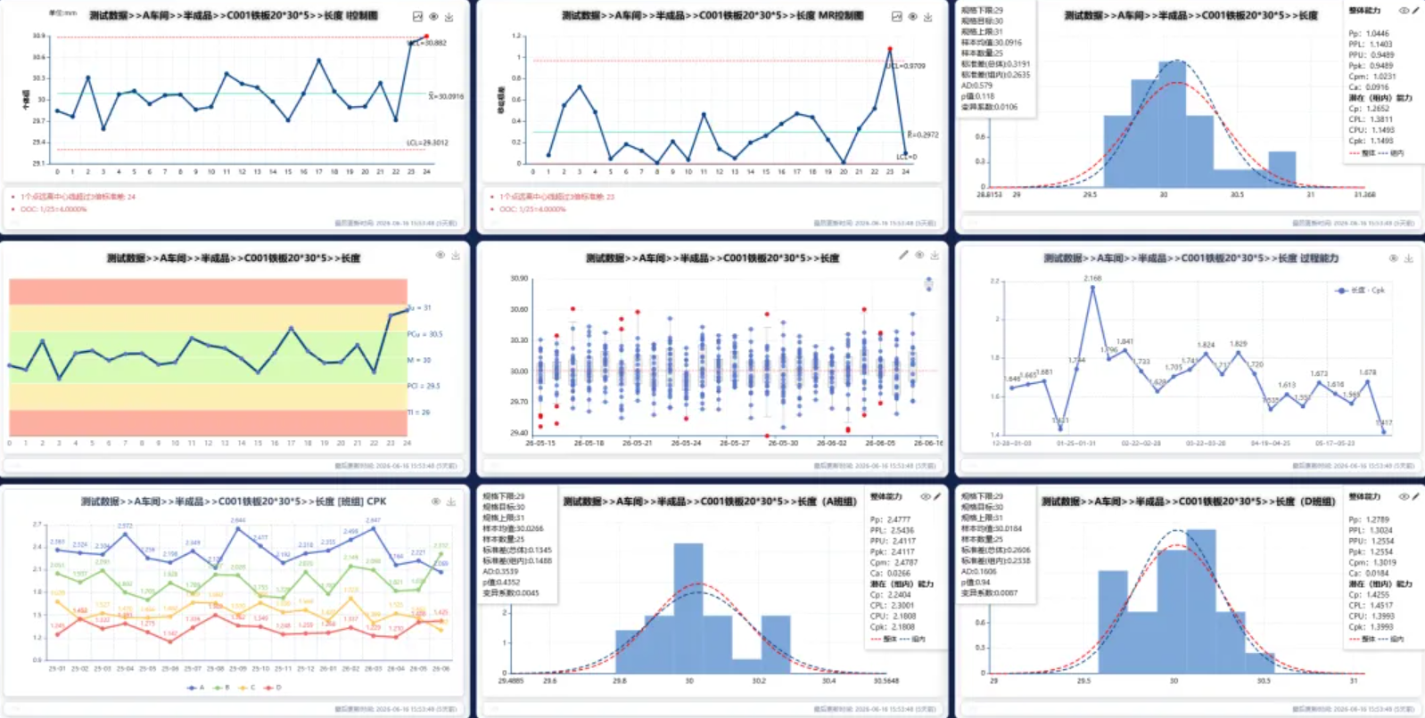
The nine-view dashboard shown here represents just one example of what is possible.
Every manufacturer has different products, production processes, and quality priorities.
Some applications require only three charts.
Others may combine control charts, capability analysis, box plots, trend analysis, Pareto charts, or customized dashboards.
NexSPC enables manufacturers to build fully configurable SPC dashboards based on their own operational requirements.
Whether monitoring a single critical characteristic or an entire production workshop, users can freely combine statistical charts to create dashboards that support their specific quality objectives.
The goal is not to display more charts.
The goal is to display the right information for faster decision-making.
Built for Real-Time Manufacturing
Behind every NexSPC dashboard is a modern Browser/Server (B/S) architecture designed for real-time industrial environments.
New inspection data can be collected through:
- Manual data entry
- Excel import
- Automated inspection equipment
- Standard APIs
- Industrial communication protocols
As new data enters the system, dashboard statistics are updated automatically without requiring manual refresh.
Because every dashboard is delivered as a secure web page, users can monitor production quality from:
- Large factory display screens
- Engineering workstations
- Tablets
- Mobile devices
Quality information is always available wherever decisions need to be made.
Why NexSPC Dashboards Are Different
Modern manufacturers don't need more reports.
They need faster insight.
NexSPC combines real-time SPC monitoring with flexible dashboard design, enabling quality teams to:
- Detect abnormal variation earlier
- Monitor process capability continuously
- Compare production performance across shifts and machines
- Identify long-term quality trends
- Accelerate root cause analysis
Instead of switching between multiple reports and spreadsheets, engineers gain a complete view of manufacturing quality from a single dashboard.
Conclusion
Manufacturing quality cannot be understood from a single chart alone.
The most effective decisions come from viewing the same process through multiple statistical perspectives.
By combining process stability, capability analysis, trend monitoring, comparative analysis, and drill-down investigation into one integrated dashboard, manufacturers gain the visibility needed to prevent quality issues before they become production problems.
Because better quality doesn't come from collecting more data.
It comes from seeing the right data from the right perspective.
That's exactly what NexSPC dashboards are designed to deliver.
